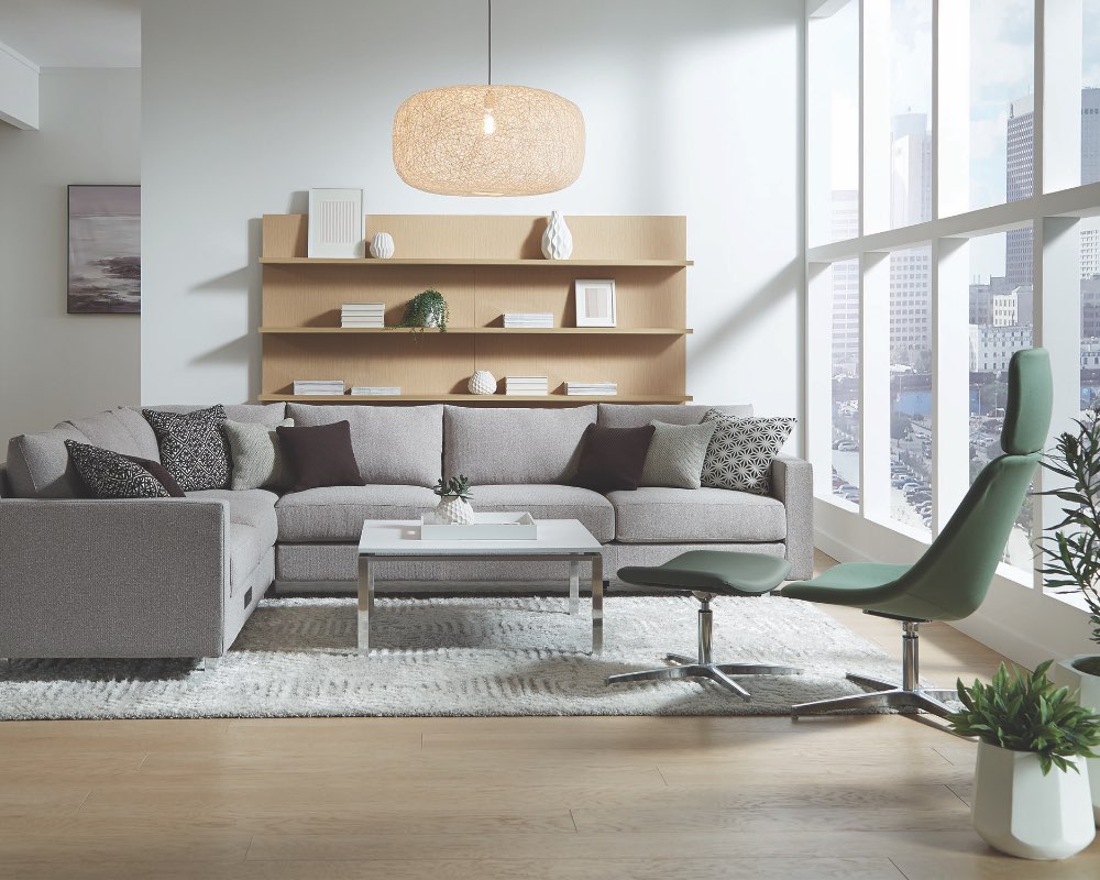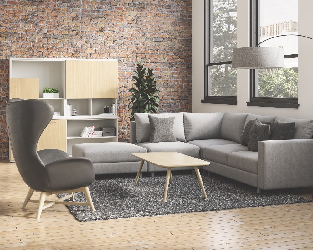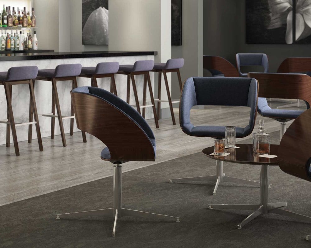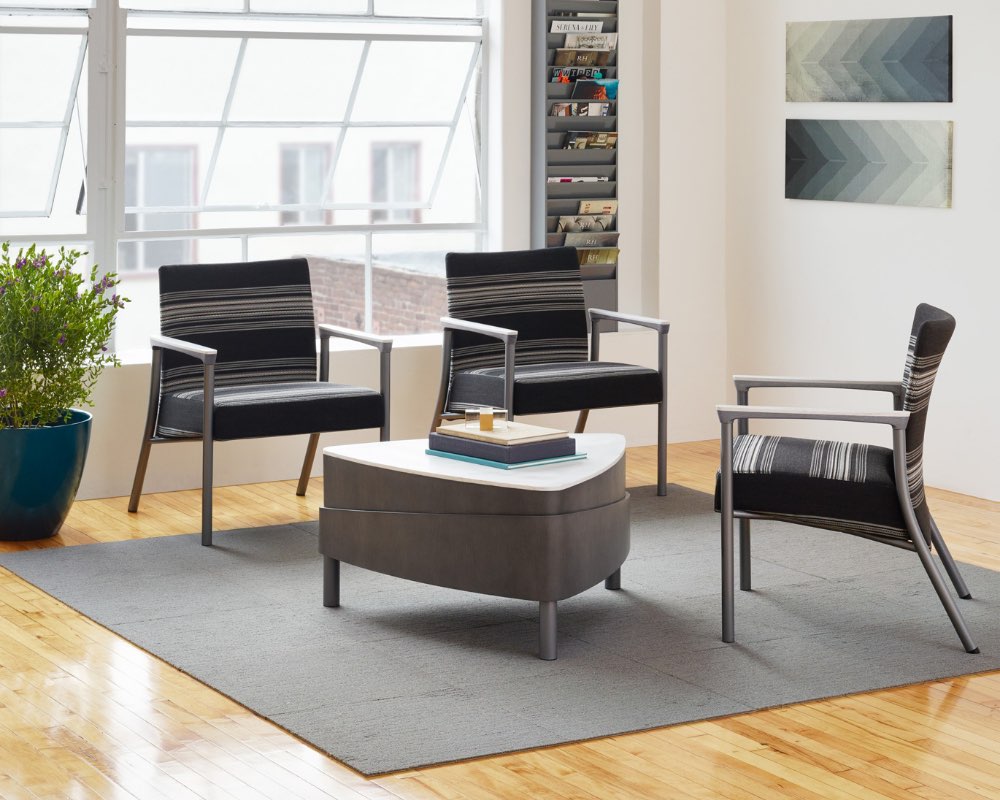
Walk into a great office and you feel it before you can name it.
The air feels right. The light is flattering. The materials look considered. The floor sounds right under your feet. Every surface reads as thoughtful. Every seat looks like it belongs. Every conference room feels ready. The space is beautiful and functional at the same time. And it does all of this before anyone has said hello.
That feeling is never the product of one decision. A beautiful and functional office is built by two disciplines working together. Design decisions that shape how the space reads. And furniture decisions that carry the design into every room, every workstation, and every meeting. Neither one alone gets an office there. Together, they create the impression that lands the moment a client, a candidate, or an executive walks in the door.
Here are the elements that separate the great offices from the merely finished ones.
The ceiling does more work than any other surface.
The single most overlooked driver of how a space feels is the ceiling. High ceilings feel generous. Exposed structure feels intentional. Coordinated lighting feels premium. Acoustic ceilings that are visibly clean, tightly gridded, and free of stains feel professional.
Most executives never look up. Every client and candidate does. A ceiling that has been thought about pays for itself in first impressions, and it often costs less to get right than any other element of the buildout.
Lighting quality is the amplifier for everything else.
There is a difference between a space that is lit and a space that is well lit. Most offices are the former.
Well lit means the color temperature flatters skin tones, the placement eliminates harsh shadows, the intensity matches the task, and the fixtures themselves are either invisible or intentional. Neither is more expensive to install. The difference is entirely in the specification.
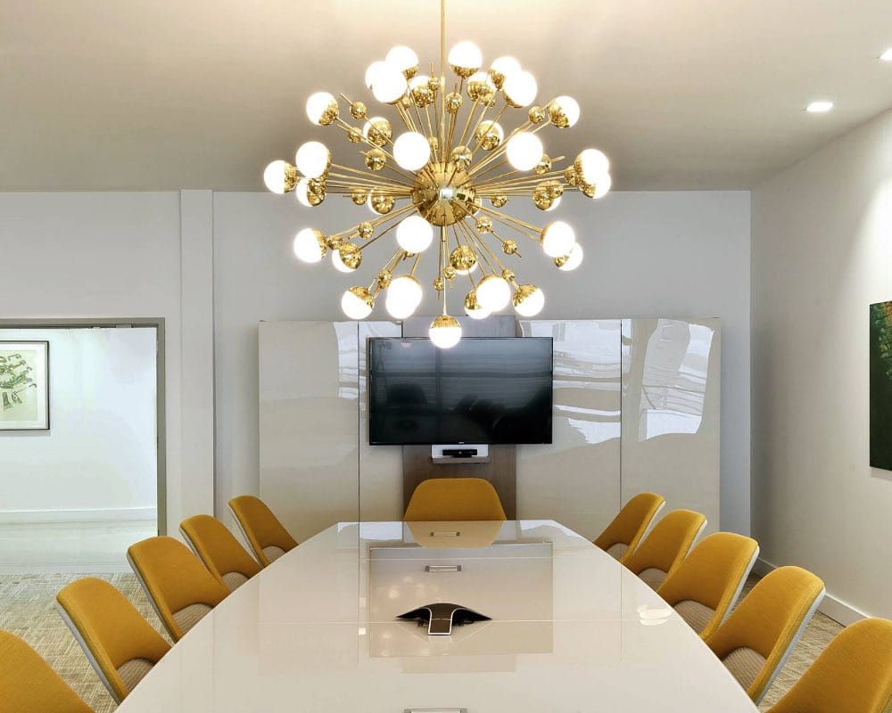
And lighting is the amplifier for everything else in the room, including the furniture. A well-lit conference room makes a well-specified table look beautiful. A poorly lit conference room makes even a premium table look tired. Great offices coordinate the lighting design and the furniture package as one specification, because the two decisions carry each other.
Materials read from across the room.
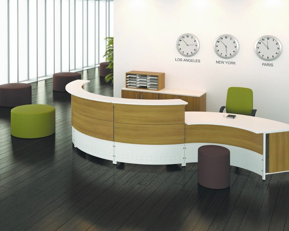
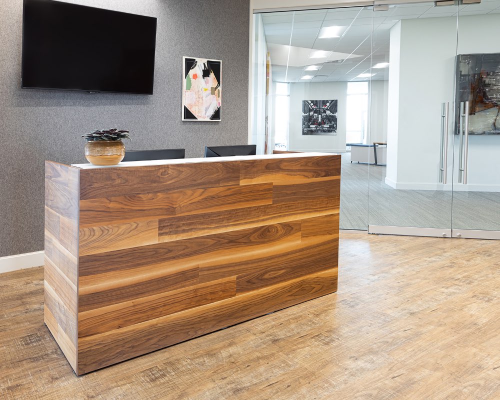
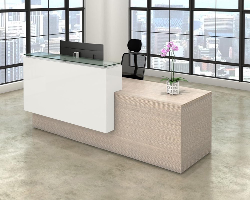
A polished stone reception desk reads as premium from thirty feet away. A wood-veneer conference table with a matte finish reads as considered from across the room. A tightly woven wool carpet reads as intentional the moment you step on it.
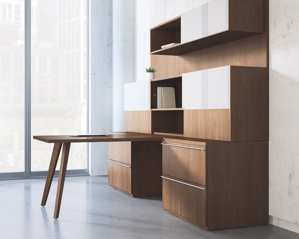
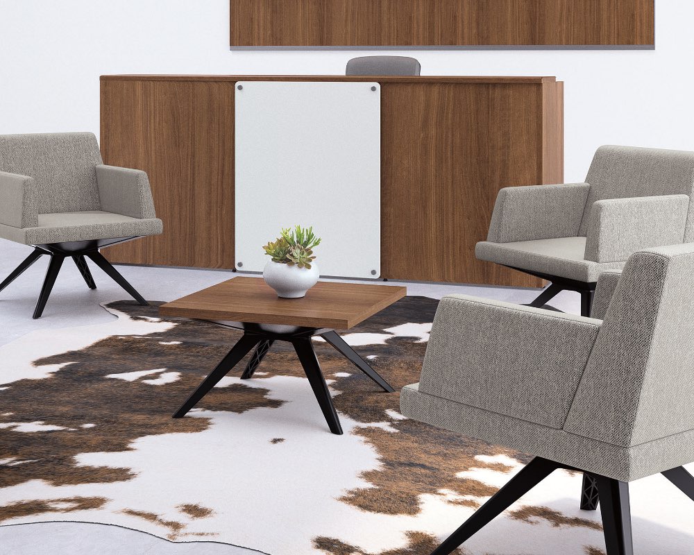
Materials communicate value before anyone gets close enough to touch them. This is why great offices reserve their premium material spend for a handful of high-visibility surfaces, and pair those surfaces with furniture in finishes that carry the same intent. The reception desk, the conference table, the executive credenza, and the lounge seating tend to be specified together, not in isolation. When the space and the furniture speak the same material language, the office reads as coordinated from any angle.
Proportion sets the room before anything is placed in it.
The relationship between a room’s height, width, and depth affects how the space feels more than most executives realize. A conference room too tall for its footprint feels awkward. A reception area too wide for its ceiling height feels flat. A hallway too narrow for its length feels institutional.
None of this is fixed after the walls go up. All of it can be planned during the design phase, when adjustments cost nothing.
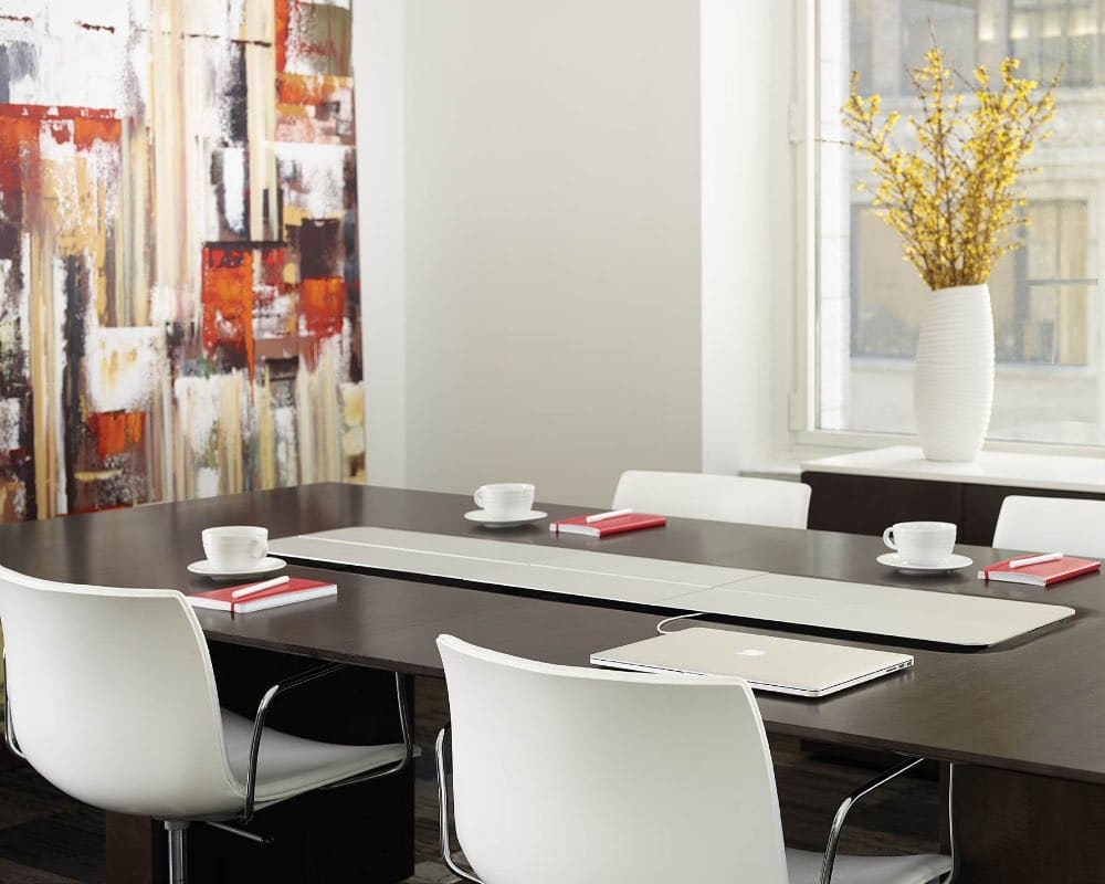
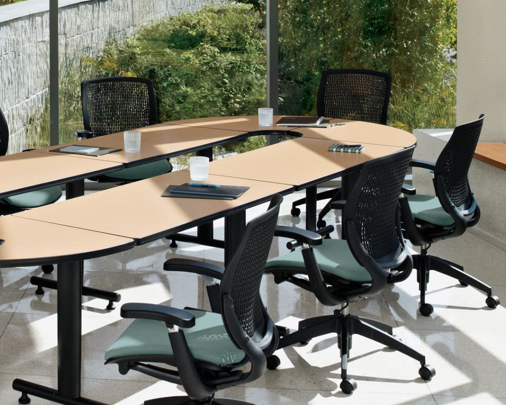
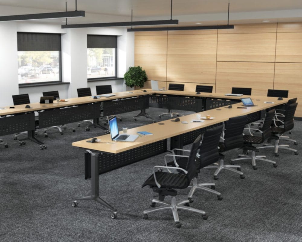
And the furniture inside the room has to hold the same proportional logic. A conference table sized correctly for the room feels commanding. A conference table too small for the room feels apologetic. A reception desk scaled correctly to the lobby anchors the space. One scaled wrong disappears against the walls. Great offices get both right, because the furniture and the room are planned as one project.
The entry sequence carries the office forward.
The lobby matters. But the walk from the lobby matters more.
In the first thirty seconds of a client or candidate visit, they walk through a sequence. Elevator lobby. Suite entry. Reception. Waiting area. Corridor. Conference room. Every one of those spaces is being read. Every transition either reinforces or undercuts the impression the last one created.
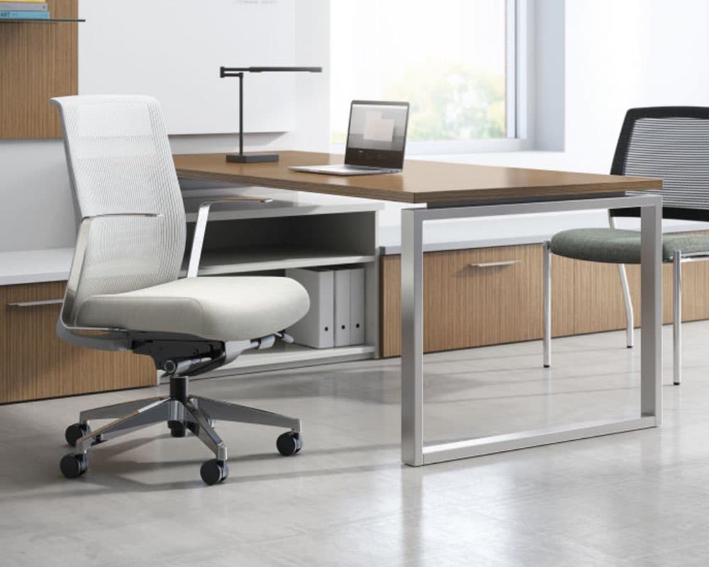
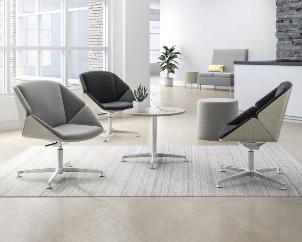
The most beautiful offices are the ones where the sequence is coordinated. Materials that flow from one zone to the next. Lighting that stays consistent. And furniture selections that read as a family, not as a series of unrelated orders. When the reception seating, the waiting area lounge, the conference table, and the executive suite all speak to each other, the office reads as intentional from start to finish.
Sound tells the truth about the space.
Executives spend enormous amounts of money on visual elements and almost nothing on sound. This shows up immediately in how the space feels.
A tile floor that echoes. A conference room with no acoustic treatment. An open floor with no absorptive surfaces. All of it makes the space feel unfinished.
Acoustic treatment is one of the highest-return investments in commercial design, and the furniture inside the room contributes to it. Upholstered seating, textile-covered panels, and soft-finish work surfaces absorb sound the same way an acoustic ceiling does. A space that sounds calm feels beautiful. A space that sounds hard feels unfinished. Both the room and the furniture play a role in getting there.
Art and furniture set the character.
Nothing telegraphs the difference between a considered office and a hastily furnished one like the art on the walls and the furniture below it. A gallery wall that has been curated feels intentional. A single anchor piece over a reception desk feels confident. A stock landscape in a black frame feels like a placeholder that never got replaced.
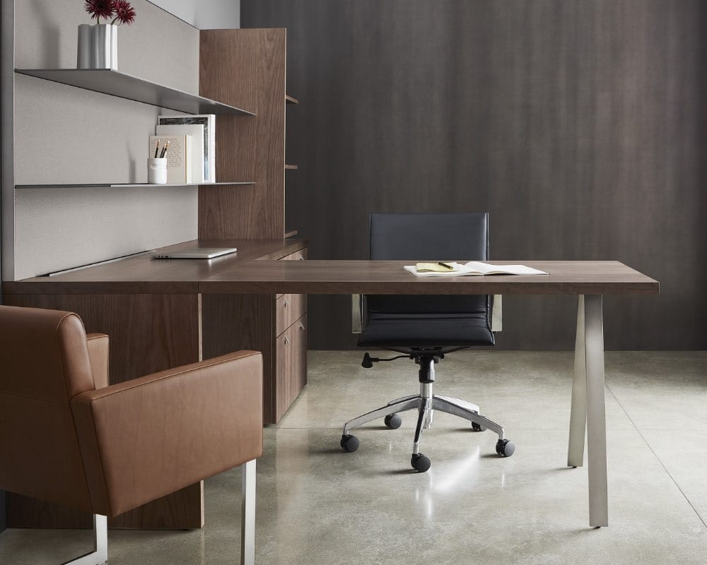
The same is true of the furniture. A curated reception cell feels welcoming. A conference room specified as a whole reads as coordinated. An executive office selected with intent reads as considered. Great offices make real decisions about both, because art and furniture are the two elements everyone actually touches and sees close up.
Beautiful and functional is not an accident.
The best offices are the ones where the design team and the furniture team plan the space together from the first floor plan through the final install. Ceiling heights and light fixtures get coordinated with reception cells and conference tables. Material palettes get coordinated with fabric and finish selections. Acoustic strategies get coordinated with upholstered pieces and soft goods. Every decision is made in service of both how the space looks and how it works for the people who use it.
When those two disciplines work in concert, the office reads as beautiful and performs as functional from the moment someone walks through the door. When they work in isolation, the office reads as adequate. Most people know the difference before they can name it.
Corporate Source and Office Furniture Plus are both part of the Total Office Solutions family of “Anywhere” companies. Corporate Source leads with design, concept development, and space planning. Office Furniture Plus leads with specification, procurement, install, and access to more than 220 manufacturers. Together, we plan office environments that read as beautiful from the ceiling to the finish and perform as functional from day one.
If your space is not doing the work it should be doing for candidates, clients, or your own team, we’re here to help.